Friday, October 21, 2011
Friday, October 14, 2011
edge exhibition for 2011
Wednesday, October 12, 2011
NSWTGDES502A CREATIVE CAREER
Wednesday, August 31, 2011
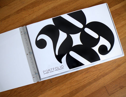
Inspiring Designer Portfolio's- What Portfolio will I choose?
Office has all you need to create a pretty smick looking portfolio...
http://www.officepdx.com/index.php
- What is the purpose of your print portfolio? (ie what kind of job are you hoping to apply for in the future?)
- What portfolio elements would your prospective employer be most interested in?
- Logo design
- Corporate Identity
- Posters
- Editorial Design
- Illustrations
Friday, August 19, 2011
Wednesday, August 10, 2011
Friday, July 29, 2011
Team Work 8 Page Booklet
With this task we were ask to design a cook book with a twist. We had to invent recipes and take the photography. As a team we decided to base the cook book on alcohol. Each recipe was to contain some sort of alcohol to complement the dish. When doing our research we noticed alot of cook books had large images this was a layout we wanted to avoid. Chris had came up a brilliant idea for a layout and then it was full steam ahead with ideas pouring out from all of us. Lea suggested the road kill for the front cover and we decided to carry the theme through the back cover as well we were to create this with photography to tie in with the images inside the booklet. From then on the group decided the recipes.
My input-
- black background with white type to imitate a chalk board
- Motif outlines of the alcohol used in the recipes
- Recipe created Oyster Vodk


Team Work was the name of the game!!
We were asked to create an 8 page coloured booklet on Wagga Wagga Tourism. The spec,s for this booklet, as follows:
- Colour Images at 300dpi
- Information
- A4
The outcome, as follows:
- Project planner, Jules
- Style Guide, Nicole
- Type Guide, Ani
- Front/back/ Title, Chris
- About, Mitchell
- Attractions, Ani
- Entertainment, Elise
- Accommodation, Pip
- Food/ Wine, Jules
- Layout, Mitchell


Thursday, July 28, 2011
Tuesday, July 26, 2011
Wednesday, July 20, 2011
Portfolio Content & Website Revision
Our client one of Australian's larger retail groups of Young Ladies Fashion, is seeking a Print Designer who is keen to join a fast paced, energetic and dynamic team. This iconic company is highly successful, it has over 100 stores and many more to come.- What are the mandatory portfolio requirements of the job?
- Portfolio was requested to be in a PDF format and resume in a word doc format.
- What skills/experience does the job require?
- Diploma or Degree in Graphic Design or Fashion Design,
- 2 plus years exp. in fashion industry,
- adobe Creative Suite,
- the ability to adapt global trends in fashion, art, music and theatre.. into feminine yet on trend looks.
- What portfolio pieces do you have that would be appropriate for this position?
- Design Samples of Flash as a rat clothing
- Illustrative Labels, logo's swing tags
- Experience in the fashion industry
- fashion posters created in photoshop and illustrator
- Would a digital or print portfolio be best suited for this position? Both?
- Print and Web would be beneficial for this position. The web would be an idea to communicate with the offshore factories.
- List the job Title, Web URL,
- GRAPHIC ARTIST / PRINT DESIGNER- YOUTH FASHION
- http://www.seek.com.au/Job/graphic-artist-print-designer-youth-fashion/in/melbourne-melbourne/19999454
One of Melbourne’s fastest growing website design and development companies is looking for a Graphic Designer to join their creative team of professionals. Based in an excellent Richmond location, this successful and established business offers an exciting and diverse role to the successful candidate, and the bright prospect of career progression.- What are the mandatory portfolio requirements of the job?
- Digital, Cover letter, Resume and sample of your work.
- What skills/experience does the job require?
- 3+ years of experience in a similar role
- A good knowledge of web based technology
- A highly creative and innovative mind and skillset
- Some examples of previous work (attach to application)
- A passion for the industry, and a love of variety within your role
- A friendly, open personality and good communication skills
- What portfolio pieces do you have that would be appropriate for this position?
- Logos,
- Freelance work
- web design pieces- Home Tavern Wagga
- Would a digital or print portfolio be best suited for this position? Both?
- List the job Title, Web URL,
- Web Graphic Designer
- http://www.seek.com.au/Job/graphic-designer-with-a-flair-for-logos-wanted-to-join-trendy-website-business/in/melbourne-cbd-inner-suburbs/20110057

- What are the mandatory portfolio requirements of the job?
- A maximum of 2mb sample of your portfolio.
- What skills/experience does the job require?
- commercial experience in a Mac
- Indesign
- Quark
- Photoshop
- Illustrator
- Excellent written and verbal communication skills interest in marketing design
- Interest in marketing design
- Highly organised, able to manage multiple tasks concurrently
- What portfolio pieces do you have that would be appropriate for this position?
- Spreads that have been produced in InDesign.
- Bookcovers that were produced in Photoshop and Illustrator.
- Freelance work
- Would a digital or print portfolio be best suited for this position? Both?
- It is requested to send a digital form of no more 2mb portfolio. If successful to reach an interview stage it would be required to have a print ready portfolio.
- List the job Title, Web URL,
- Graphic & Online Designer
- http://www.seek.com.au/Job/graphic-online-designer/in/melbourne-melbourne/20138476
Monday, June 27, 2011
RESEARCH AND EXPERIMENT WITH TECHNIQUES TO DEVELOP TYPOGRAPHY.
This assessment involved designing 9 book covers in different visual styles and using different styles of Typography.The styles included aggressive, passive, modern, retro, classic, monotone, futuristic, dynamic and grunge.
The hero-narrator of The Catcher in the Rye is a child of sixteen, a native New Yorker named Holden Caulfield. Through circumstances that tend to preclude adult, secondhand description, he leaves his prep school in Pennsylvania and goes underground in New York City for three days. There are many voices in this novel: children's voices, adult voices, underground voices — but Holden's voice is the most eloquent of all. Transcending his own vernacular, yet remaining marvelously faithful to it, he issues a perfectly articulated cry of mixed pain and pleasure.
aggressive-ready or likely to attack or confront.Title: Pea Alexis Regular
Pea Alexis is a hand formed typeface. Its sharpness of the strokes gives this typeface an aggressive personality. The split in the word catcher was applied to achieve forceful effect. I felt that the Authors name was to have more of a uniformed effect. This was achieved with Minion Pro in uppercase being a serif typeface it's strong appearance with different stroke paths. It was important to choose the right image, which would unite with the typeface to achieve an aggressive effect.
Title: Jane Austen
Jane Austen typeface is a script font with an organic character of it's own. Its flowing lines running into each letter gives the effect of being passive. The rule of thirds was applied to this cover with the Title and image. The image has soft undertones to create peacefulness to the overall cover. New Gothic MT reg was used for the Authors name. The softness of this San Serif united nicely with the Script typeface. The duck in the pond is an iconic feature of the storyline to The Catcher in the Rye.
Retro captures colour and image in a harmonious way. The Wonderful World of Retro font is more a display typeface with its elaborate strokes give s this typeface it personality. It suited the retro style and came together well the image. The retro red hunters hat created hierarchy, which also is an iconic symbol in the novel.
Even knowing that Bodoni is classed as a modern typeface. I believe it has very similar characteristic to the Old style. The Serif typeface has a classic look, which adapted well to the style of the book. The variation between the thin and thick strokes gives this typeface a tonal quality. A gold leaf was applied to the font and border of the leather cover to achieve a classic feel.
Myriad has a warmth and readability that lead itself quite well to the Monotone style. Its clean open shapes, precise letter fit make an excellent choice to capture the style of the image.
Colorlines is a typeface designed by Antongride. Its unique tubular form gives a futuristic character that adapts to the cover quite well. The image was produced using a Photoshop tutorial. Together with Colorlines the unity of 2 styles creates a futuristic cover.
Once again Myriad was chosen as the typeface as its strong strokes works well with the treatment that was applied to create a shattered effect. This gave the title movement that unites the style to the Title. It was important to keep the imagery simple so it didn't detract from the style of the typeface focal point.
grunge-grime; dirt.A Bite has an awesome dirty/grungy feel to its letterform. The boldness of this San Serif is eye catching. A shadow of this typeface was applied to give the style rawness.
All images were sourced from Flickr.com


