Saturday, February 27, 2010


Here are some of my images....


Three of the kind...

Brown Sugar...


Pictures through stain glass...
Wild Berries...
As night Falls.....

Thursday, February 25, 2010

Polaroid Mania

Polaroid photos are awesome they give the image great texture and ambiance, here are a few I found interesting......


Whats in a logo!


I love this logo, it's well balanced with with variety of color and images. The uses of hand prints give it a child like, piece of artwork. The two fonts show dominance and fun.


The combination of colors work well together. The ark being a lot bigger draws you into the logo and the bird form adds a nice balance. Having the giraffe in the logo is a child friendly figure.


Nice, clean, colors. The logo is very inviting the green gives it a minty feel. It is very crisp . I like the Idea of a people holding up the tooth brush it gives this logo a family friendly feel

There is a very powerful meaning behind this logo I think the imagine is strong and the color is subdue enough to give it a nice balance.


Awesome colors used in this logo the font is nice and bold so you get the message I think the logo gives you the idea that this is a place you go and come out a winner!

This is a place you go to get muscles the logo give you the feeling its a men's only gym with it's comical little man. The text wrapping around the weights is effective. A background might give this logo a little more grunt.

This logo feels light and airy it has rhythm, it brings the messages across quite well the colors used are pleasant to the eye. The font is not to busy which gives the logo a clean crisp feel.


This logo has a little character, I don't know if this works for me I think the bloomers on the clothes line confuses things if the flowers weren't added in the font it could be confused with a laundry mat service in saying that it has nice balance.

This logo has a very classical feel, it's repetition with the capital letters is interesting and the colors are soft and inviting. It has a nice sense of balance I love the idea of the William Morris touch with the capital font.

I like the vibrancy of this logo the green background works well and the two fonts are pleasing to the eye. The vine leaves coming off the last letters add a soft and delicate touch.

Tuesday, February 23, 2010

The grass is always greener on the other side!


We were given a task to composite 10 elements from different sources to portray "The grass is always greener on the other side" I wanted to communicate Poverty in third world countries and how World Aid has made a difference today.

Monday, February 22, 2010

Space Odyssey 12


Today was the day to enter space. The challenge was to make a composite of a number of items and put them in a space background this task was going to show off my pen anchor skills for sure.... Once selecting all the items and turning them into a vector seals I had to put them in their place a bit like moving furniture around in a house, never quite satisfied, after having tugs of war with myself I finally came up with this.......

Photoshop


Today's task was to formalize yourself with the tools that photoshop has available , we were introduced to the pen and pen anchor tools and how to form a composite. We used these tools to create a composite with fruit - apple, pear, orange, banana and grapes the most challenging for me were the grapes but lost of fun.....

Saturday, February 20, 2010

Photographers

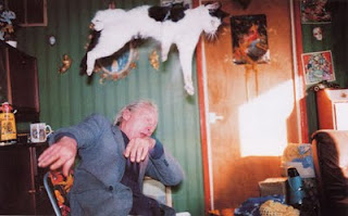
You have to wonder what this gentleman is thinking!!!!!

Martin Parr
1952-Epsom
Surrey Britain,

Not the most favourable photographer in the industry. Martin Parr has had an interest in photography since his childhood days. He has a unique perspective and an interesting (if not comical) view of the world.


"Conde Nast" Magazine 1928
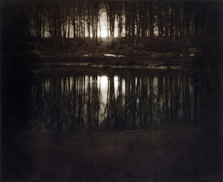
"The Pond Moonlight" 1904

Edward Steichen
1879-Luxembourg

Edward Steichen famous for his pictorialist photography/painter in the United States and abroad. When entering the photographic world, Steichen applied the soft focus style to his images then eventually banishing the gauzy light of fashion to a more clean,crisp lines to modernism which is seen in the image "Conde Nast" One of my favourites would have to be "The Pond Moonlight" an early piece of Steichens .This image has a very dream like quality with color and natural lighting.
Robert Adams
1937-New Jersey,


My favorite image of Robert Adams would have to be "Summer Nights" This moonlit image with its long depth of field has beautiful light and shade, the Ferris wheel being the center frame draws you into the image. Robert Adams is well known for his landscape images.
Jeff Wall
1946-Canada,

Well known for his digital photography. Wall produces large scale back lite images. There was one particular image I was drawn too "Dead Troops Talk"This image brings out the humorous side of Life and Death. The colors in this shot are almost dull which give the image a very rustic feel.
Gregory Crewdson
1962-Brooklyn,

As a teenager Crewdson was a part of punk band called the Speedies that had a hit song "Let me take your photo" Photography was definitely his calling.He is best known for his elaborately staged surreal scenes. He has a real complexity of lighting. The contrast in this image is very make believe and dreamy.
Cindy Sherman
1954-New York
,

Cindy's photography blurs the boundaries of individualism and identity, while showing herself in a army of different characters. This imagine says it all.
Richard Billingham
1970-Birmingham,


More known for his art, Richard Billingham fell into photography taking random candied imagines of his disfunctional family. The imagines remind me of the ones taking in the 70's with their brash colors and bad focus.

Thursday, February 18, 2010


Nobuyoshi, Araki

Tokyo,1940


I was captured by this imagine by the way it's divided by a stairwell it almost looks to be two imagines put together. The contrast between light and dark is very vivid. Araki is a very comical man and some of his work is precised a provocative and very intimate.


Tony Vaccaro
1922 Pennsylvania
"In no mans land"

This is a image of Private Ivan Parrott of Decker ville, Michigan. during the Battle of the Rhine. I love the exposure of this shot the developing process giving that grainy feel the framing is centered, it has capture the true essence of time.

Wednesday, February 17, 2010


larry
clarke

Larry Clark photos can be confronting and controversial he likes to capture the real world we live in. A particular shot I was draw too was Teenage lust,The framing is a Little off center and love the contrast of this shot the light reflecting off the pavement and the innocence of the teenage guy.

Thursday, February 11, 2010

Get The Glass review

Today was a day of game play. We were introduced to a game called Get the Glass. Its about the Adachi Family who are milk deprived and will do anything to steal the milk....

Wow!!!! What a game the graphics in this game are awesome so much light and shade and detail which i really love. As for the game itself It's soo frustrating but in saying that I have to play it again and again.......

Tuesday, February 9, 2010

Welcome to my design Blog.....