Monday, June 27, 2011

RESEARCH AND EXPERIMENT WITH TECHNIQUES TO DEVELOP TYPOGRAPHY.

This assessment involved designing 9 book covers in different visual styles and using different styles of Typography.The styles included aggressive, passive, modern, retro, classic, monotone, futuristic, dynamic and grunge.


The hero-narrator of The Catcher in the Rye is a child of sixteen, a native New Yorker named Holden Caulfield. Through circumstances that tend to preclude adult, secondhand description, he leaves his prep school in Pennsylvania and goes underground in New York City for three days. There are many voices in this novel: children's voices, adult voices, underground voices — but Holden's voice is the most eloquent of all. Transcending his own vernacular, yet remaining marvelously faithful to it, he issues a perfectly articulated cry of mixed pain and pleasure.

aggressive-ready or likely to attack or confront.

Title: Pea Alexis Regular
Author: Minion Pro

Pea Alexis is a hand formed typeface. Its sharpness of the strokes gives this typeface an aggressive personality. The split in the word catcher was applied to achieve forceful effect. I felt that the Authors name was to have more of a uniformed effect. This was achieved with Minion Pro in uppercase being a serif typeface it's strong appearance with different stroke paths. It was important to choose the right image, which would unite with the typeface to achieve an aggressive effect.


passive-accepting or allowing what happens or what others do, without active response or resistance.

Title: Jane Austen
Author: New Gothic MT reg

Jane Austen typeface is a script font with an organic character of it's own. Its flowing lines running into each letter gives the effect of being passive. The rule of thirds was applied to this cover with the Title and image. The image has soft undertones to create peacefulness to the overall cover. New Gothic MT reg was used for the Authors name. The softness of this San Serif united nicely with the Script typeface. The duck in the pond is an iconic feature of the storyline to The Catcher in the Rye.


modern-relating to the present or recent times as opposed to the remote past.

Title: Comforta Light
Author: Comforta Light


Comforta light has an airy openness with each letter. The strokes are round and clean for a San Serif, which was perfect for the modern style cover. The image was applied dividing the title of the book to achieve a contemporary feel with I believe ties in well with the modern style.


retro-imitative of a style, fashion, or design from the recent past : retro 60s fashions.

Title: Wonderful World Of Retro
Author: Agnes Serif


Retro captures colour and image in a harmonious way. The Wonderful World of Retro font is more a display typeface with its elaborate strokes give s this typeface it personality. It suited the retro style and came together well the image. The retro red hunters hat created hierarchy, which also is an iconic symbol in the novel.


classic-a work of art of recognized and established value.

Title: Bodoni XT reg
Author: Bodoni XT reg

Even knowing that Bodoni is classed as a modern typeface. I believe it has very similar characteristic to the Old style. The Serif typeface has a classic look, which adapted well to the style of the book. The variation between the thin and thick strokes gives this typeface a tonal quality. A gold leaf was applied to the font and border of the leather cover to achieve a classic feel.


monotone-of a single color.

Title: Myriad Pro
Author: Myriad Pro

Myriad has a warmth and readability that lead itself quite well to the Monotone style. Its clean open shapes, precise letter fit make an excellent choice to capture the style of the image.


futuristic-having or involving modern technology or design.

Title: Colorlines
Author: Bedas reg

Colorlines is a typeface designed by Antongride. Its unique tubular form gives a futuristic character that adapts to the cover quite well. The image was produced using a Photoshop tutorial. Together with Colorlines the unity of 2 styles creates a futuristic cover.


dynamic-producing motion.

Title: Myriad Pro
Author: Myriad Pro

Once again Myriad was chosen as the typeface as its strong strokes works well with the treatment that was applied to create a shattered effect. This gave the title movement that unites the style to the Title. It was important to keep the imagery simple so it didn't detract from the style of the typeface focal point.


grunge-grime; dirt.

Title: A Bite
Author: Abadi MT condensed light

A Bite has an awesome dirty/grungy feel to its letterform. The boldness of this San Serif is eye catching. A shadow of this typeface was applied to give the style rawness.


All images were sourced from Flickr.com

Friday, June 24, 2011

ICAB5165B-CREATE DYNAMIC WEB PAGES

PORTFOLIO WEB SITE


DOMAIN NAME:
http://64.37.52.109/~creati11/index.php

Thursday, June 23, 2011

David Carson Inspired Type Treatments


We were asked to explore the style of the Legendary David Carson and create work to the same style...Here is my attempt.

GDESS501A-CLASS EXERCISE


Here are 10 rebuilds of type websites...


Defining Graphic Design

Defining Graphic Design

Jules Ang.

1. Graphic Design is a form of visual communication that is designed to attract an audience. It can be achieved through many ways of mediums e.g.: type, photography, illustrations and motion graphic’s are to name a few. It can give a company an ID or promote a new or existing product.

2. Branding is a form of building identification for a brand group. It incorporates the creativity of a brand, brand name, package design, environmental design, website and on screen. There is a lot more involvement with Branding than say Identity Design.

3. The Identity applications consist of logos, visual identity, corporate identity and branding across media. It achieves a personality through its visual display.

4. Corporate Communication applications consist of sales kit, annual reports, brochures, corporate websites and Internet. This helps the corporate industry to communicate consistently with each other.

5. When researching Environmental Design I discovered that the design is very straightforward with a lot of information on the products distributed and information to help a wide range of audience. I research W.L Gore & Associates INC… they are a corporation that supply a wide range of industries with Textiles, Environment, Medical, Military, Aerospace and Auto. The site is easily to navigate around. And has a lot of information for the consumer.

6. A common example for information design in Wagga, Wagga would be the directory at the mall that helps you locate a store

7. Information, Experience or Interactive design is a large amount of complex information communicated to a wide spread audience. Face book would have to be one I could mention that is interactive and also attracts a large audience. Professionals in Wagga have an interactive Screen for advertising their properties for sale.

8. A graphic designer puts text and an image together for a visual representation where as a Motion designer is screen based and deals with a lot of animations and moveable communication.

9. Promotional design communicates the sale of brands, events, and ideas and to promote groups.

10. A typographer develops and designs typefaces.

11. Lettering is an analogue generated letterform as opposed to type generated on a computer.

12. The Wagga Council uses mass media to promote up and coming events on banners in the main street of wagga. Bunning’s and other retail stores in Wagga promote them selves in the local paper or on TV.

13. The demographics are the statistic data of a population showing the average age, income, education etc.

14. Employment for graphic Designers are generally in Design Houses, publishing firms, marketing companies communication firms and self employed- freelance.

15. The benefits that arise when working with someone are the gain of design experience. Introduction in running a small business, gaining knowledge if you’re lucky enough to work along side a printer.

16. As a Designer when working with a client it is a process of collaboration. Depending on the assignment the involvement may include creative directors, design directors, productive experts, copywriters, and printers…

17. Design matters in many ways. It communicates visually drives the economy and provides information to the public.

18. The urgent world wide concerns and Graphics Design stated in a manifesto “First Things First” are” Cultural interventions” looking towards educational tools health tools, information design, public service advertising campaigns.

19. Advertising matters in many ways as well. It drives the economy and provides information to the public.

20. It is important for Graphic Designers to have an ethical practise to bring better products and services to your clients. It is the responsibility of the Designer to create tasteful and respectful design.

GDESS501A-THE DESIGN SOLUTION

REPORT


Our initial meeting with Trevor Jones was brief. The questions I asked Trevor were,

  • What did he want us to design?

Trevor wanted a template to advertise the regular bands that play at the Home Tavern.
He was also interested in getting his website updated.

  • What was he looking for in design of the graphics for the TV's?

Trevor was relying on us to come up with the ideas.

  • How many regular bands?

We organized for Trevor to email me with a list of the regular bands that play at the Home Tavern. Trevor also supplied me with a contact number for the photographer- Duane who maybe able to help us out with some images of the regular bands.

  • What program's that was used previously?

Trevor had previously used Word to design and upload graphics onto the TV's.

  • Ideas on designs that he might like?

Trevor mentioned years ago the Bands would supply Band Posters to advertise when they were playing at the venue. They no longer do this, hence the digital advertising.

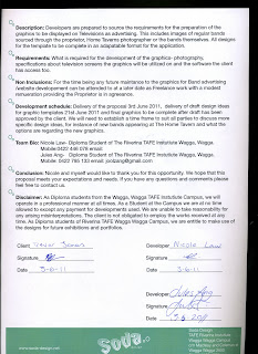
I felt that Nicole and I acted in a very professional manner. Trevor had made a comment when receiving the Proposal that it was "Very Professional".

Not at any stage did I feel intimidated by Trevor. He was very easy to work with.
After our first meeting, the next step was to do some research. I had more questions that needed to be answered. So we took the opportunity to ask them when we delivered the Proposal.

INDIVIDUAL PROPOSAL


GROUP PROPOSAL


GDESS501A-GENERATING IDEAS


My ideas for the design was to give an urbane twist. Bands are know for playing in rustic venues so I felt that it was important to add a little grunge to the graphics. The theme i went with was to have posters of the up and coming bands on a wall in the styles of graffiti, band posters and paint. This idea was favored by Trevor with some tweaking to get the desired effect.

GDESS501A-UNDERTAKING RESEARCH TO FORM THE DESIGN SOLUTION

TV advertising captures the patrons attention inside the hotel. Which is a beneficial idea.
Facebook seems to be the place that the Wagga pubs like to advertise up and coming events. Posters seem to be popular as well. You can find them also outside the venues.

GDESS501A- DEFINING THE DESIGN CHALLENGE


Here are some concepts that were shown to Trevor at the Home Tavern.

Graffiti Wall- The typeface in the first draft for the band names were to hard to read. A readable font was applied.

Band Poster- This was heading into the right direction, Trevor asked if the bands could be on individually to make it easier to display the playing day.

Final concept- Bands to be advertised on a wall.