Sunday, May 30, 2010

Assessment_BSBDES302A


Heaven
Seeing Heaven through a child's eyes a world they imagine they could live in is just behind the wall.
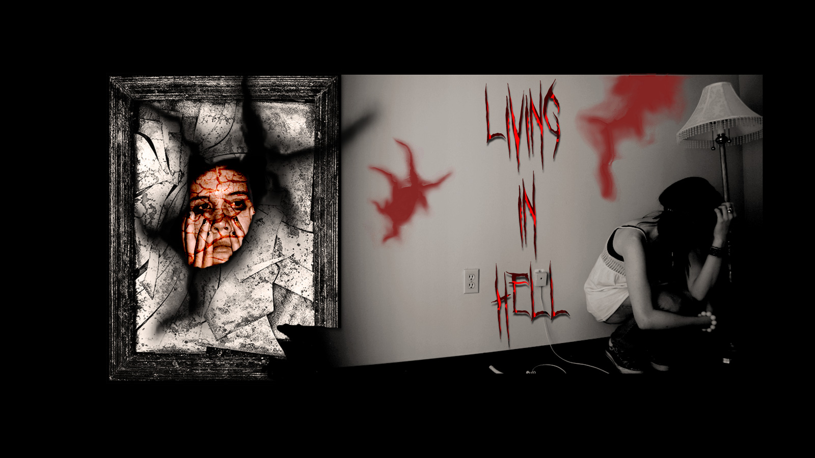

Hell
Olivia see a reflection she doesn't want to believe. I had fun applying different effects with photoshop to create this image.


Harmony
The magic garden influenced by the movie Alice in Wonderland. I wanted to capture Unity and Rhythm as I think this is a significant way to express Harmony.


Dissonance
Set in a forest the Werewolf and a Black Angel fight to win the soul of Cecilia.


Chaos
I decided to portray chaos with a girl battling with teenage life, the tug a war with child verses adolescences.


Control


This composite was based on the three wise monkeys. See no Evil, Hear no Evil and Speak no Evil. We can control what we See, Hear or Say. Photoshop and illustrator were both used to create this image.

Tuesday, May 25, 2010

Serial cut

We were asked to explore a website called Serial Cut. It's founder is Sergio De Puerto and it was established in 1999.Their clients come from big and small companies like Nike, Diesel Fragrances, LG Phones, Coca-Cola, Mc Donald's, MTV and Rolling Stone just to name a few. They like to use Type and imagery with all of their products as they feel it plays an important role in the end product. Their inspiration comes from current and past decades but they like to bring in today's perspective with an actual look. Serial Cut like to go beyond with whats in the clients minds to challenge both in terms of technique and concept, and to always end up with a contemporary and fresh result.

I love the fast forward designs, they have a sense of Surrealism. I find Sergio De Puerto Style of work very inspirational.


Vacation Cube


The New Classic


Imaginary Flying Circus.

Friday, May 21, 2010

Web Skin

Here is a first attempt creating a web skin for a color assessment.


Wednesday, May 19, 2010

Color illusions


Today's task was to explore color combinations and how colors can affect each other.

Monday, May 17, 2010

Fruit Juice Abstract

Today's Task was to create an abstract image for a fruit juice product and add attractive colors to suit each genre.


Sunday, May 16, 2010

Exploring Typography

Today we were given words to use in Type, our challenge was to display them in an attractive way.

Tuesday, May 11, 2010

Assessment-CUFDIG304A


Report


Crown Airlines Logo
Changing the pin line around the shape of the logo displays movement.


Business Card
The opacity in the swoosh was lighten and borders were placed to form unity.


Letterhead
Placement of business details were arranged to create balance.


With Compliments Slip
The appearance of the type for With Compliments was change to a more stylish typeface.


Bookmark
Borders were incorporated to give the product tightness.


Front Brochure
The brochure rearrangement has help to marry in with the other products.


Inset brochure
Background colour was obliterated, frames were placed around the photo to give a soft edge.


Assessment No-2 ready for a critique.


Some ideas for the logo.


Airline logo


Business card 1


Business card 2


Letterhead


With Compliments Slip


Bookmark


Front of Brochure


Inside Brochure

Photograhy Assessment-CUFDIG303A

Assessment No-1. This assessment was to provide 10 images using a Toy as your subject. We were to challenge ourselves and be creative with our images. For me this is the first time using a digital camera as I'm use to a analog It took a little while to work things out.


portrait


low depth field


High depth of field


urban


Black & White


Night


stain glass


afternoon sun


river


sundown

Friday, May 7, 2010

Exploring Color


Today we were asked to explore the colors in a image and make a color chart with the RGB and CMYK codes. I found this task very interesting, there are so many colors in one image.


Task 1


Task 2

Thursday, May 6, 2010


I went for a simplicity in this logo and a tight symbol